Stay Tuned is a full service entertainment label that
specializes in music and production management.


This team knows good music, and they're focused
on elevating talent across North Carolina.


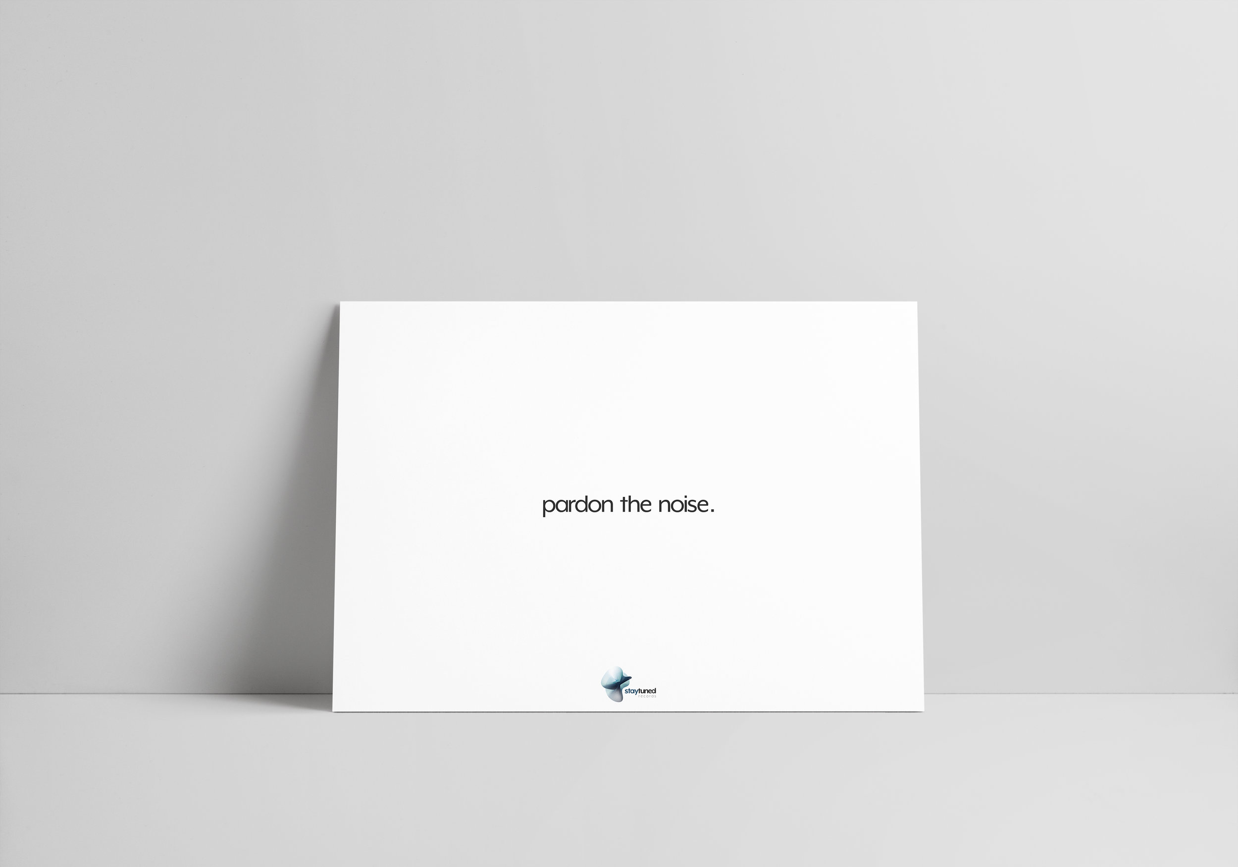

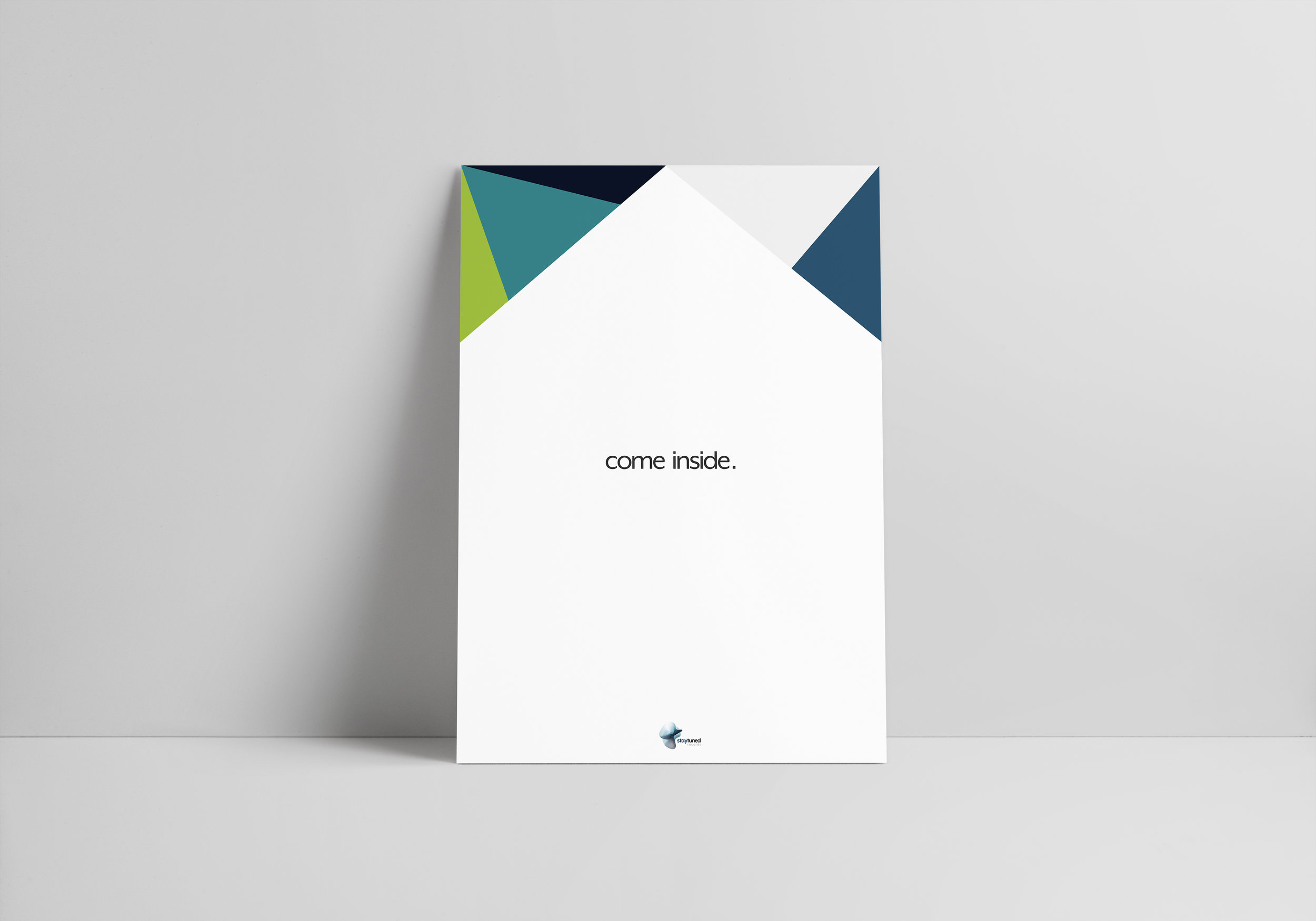
brand poster series for Stay Tuned Records
background
Stay Tuned Records was born as a means to organize and manage the business affairs of local artists. With a passion for soulful music and good vibes, Nick Hinsley co-founded the company to give singers and songwriters a platform to produce their best work. He’s confident that his ideas of mixing various technology with music will elevate the way consumers see and enjoy modern entertainment. “We want to simplify the way people access their music and the way artists get paid,” said Hinsley. “Beyond that, we’re just look for good music.”
The team behind Hinsley is ready too. They’re young, energetic, and like a tight-knit family that works to scout and provide structured management for their clients. As they know the music and its industry rapidly changes, they find ways to keep the label's evolution and energy alive as they prepare to make a mark in music.
“We want to simplify the way people access their music and the way artists get paid.”
the challenge
As a new company, this team desired a logo that represented the impact of the music they’d focus on releasing. But as we kept digging and analyzing their goals, we discovered that the energy and dynamic nature of the brand would become most central to Stay Tuned’s identity. The characteristics the team identified with the strongest were: house (gather, organize, and structure artists), dynamic (changing and evolving with high energy), and modern (approach to music, marketing, and recruiting).
The Creative Brief: Develop branding and create a visual identity for Stay Tuned Records.
the strategy
With this knowledge, I begin to sketch ideas around what Stay Tuned represented. It seemed appropriate that an undefined, evolving shape suggesting motion fit the brief and would describe the key characteristics well. As a group that’s constantly building something, we also toyed with the idea of blueprints or sound waves that seem to be leading to something. However, it seemed better to use a wireframe to represent the growing structure of the brand and its products.
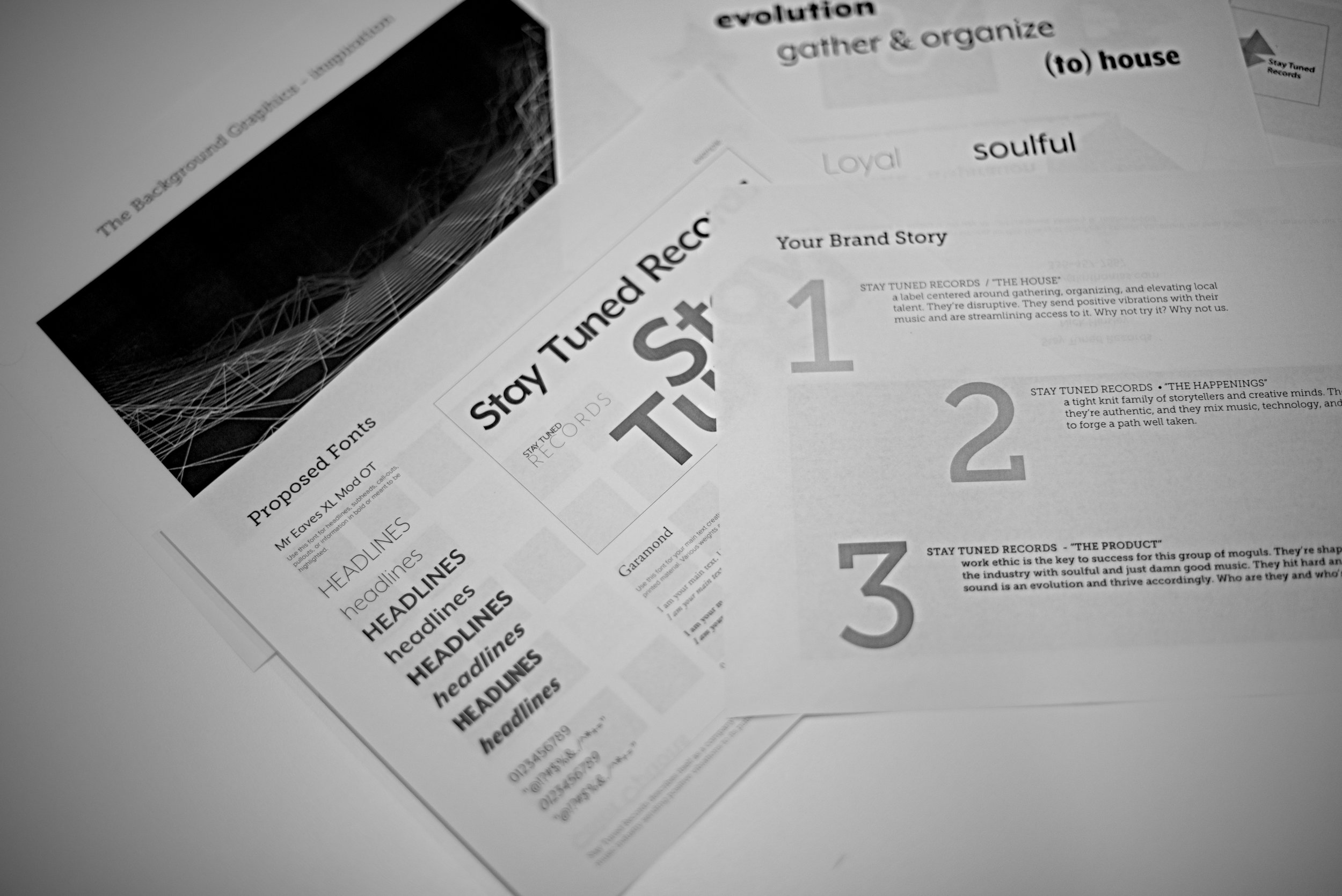
brand and logo development for Stay Tuned Records
the solution
Reflect the dynamic, evolving nature of the brand and it's commitment to sending positive vibrations to listeners.
1. Create a clean shape that conveys energy, motion, and evolution.
2. Develop a color scheme that reflects the vibes of the music and entertainment to come.
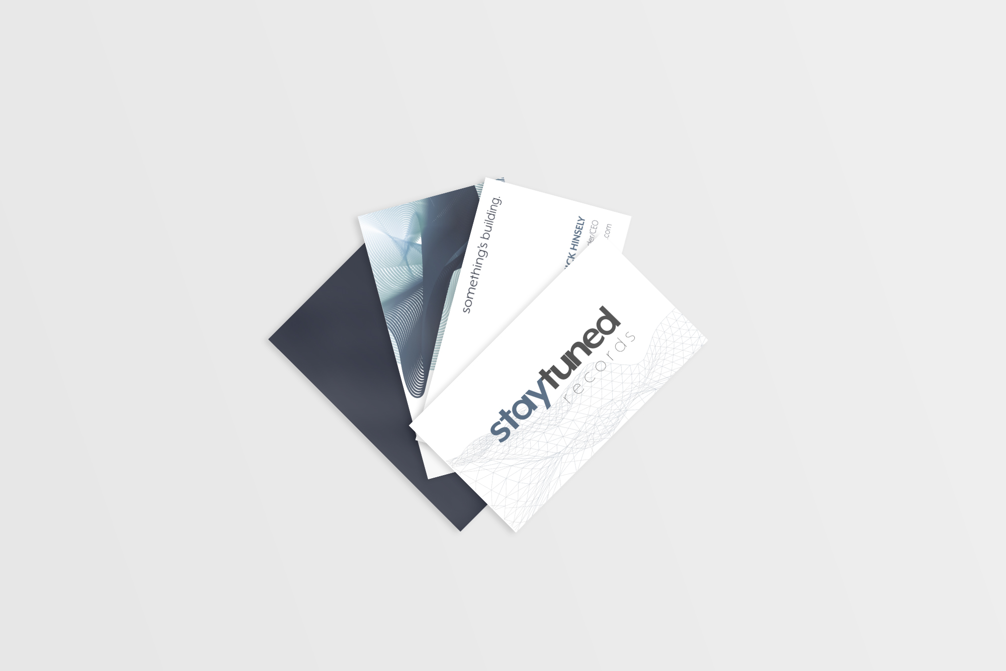
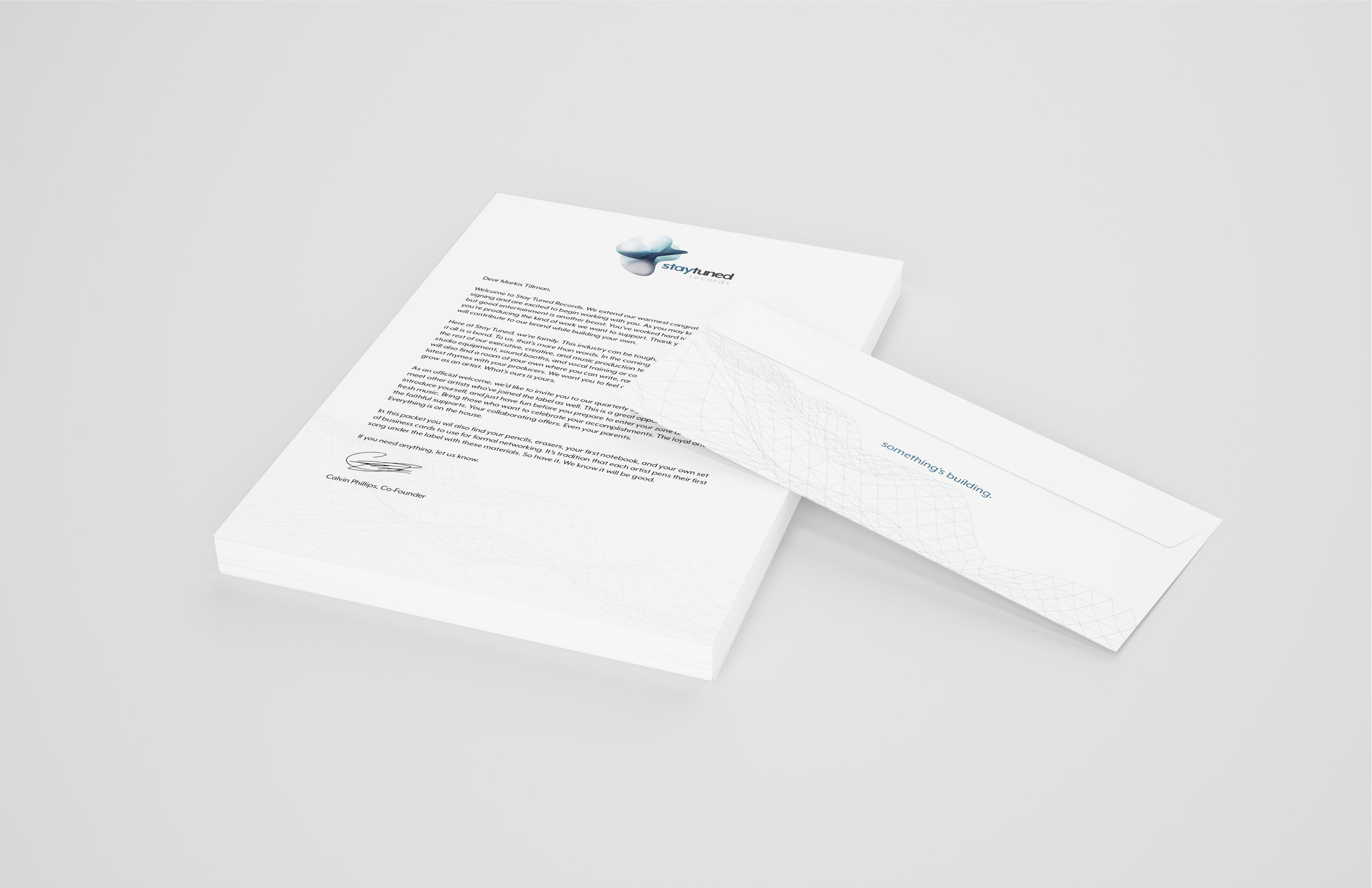
3. Create a graphic that implies building or construction.
4. Develop copy and imagery that focuses on the way Stay Tuned Records provides organization and and structure for its artists.


To learn more, visit www.instagram.com/staytuned_rec/
Stay Tuned Records strategy development, content development, visual identity, copywriting, and design work: Kimberly N. Thomas
Project produced in 2017 | All rights reserved.
NEXT: Danish Institute for Study Abroad