
The Danish Institute for Study Abroad is a
Scandinavian exchange program for American students.

With a focus on immersive learning and professional instruction,
DIS gives students hands-on exposure to a field of their choice.
background
“Scandinavia as your home, Europe as your classroom.”
That’s truly the way of life for students at DIS. The Danish Institute for Study Abroad was founded in Scandinavia in 1959 to provide a unique learning experience. While enrolled, students are immersed in Danish culture and given three travel weeks each semester to explore an area related to their field of interest. Working professionals who have the credentials and connections to expose students to real industry work teach the courses. They also guide students on cross-country study tours to provide field experience. Today, DIS offers over 190 unique study options that are taught from the perspective of Danish and European culture. In the studio design program in Copenhagen, Denmark, we were each tasked with creating a new visual identity for DIS.
the challenge
DIS is situated in the middle of the city. It spans several streets and its facilities are in various buildings that are mixed in with other businesses. A common concern among students is how to efficiently locate those facilities and all of the program's other resources. In the past, there has been difficulty finding a cohesive way to navigate DIS and the city of Copenhagen. As a part of the identity redesign, I felt this might be an important issue to address.
The Creative Brief: Create a visual branding system.
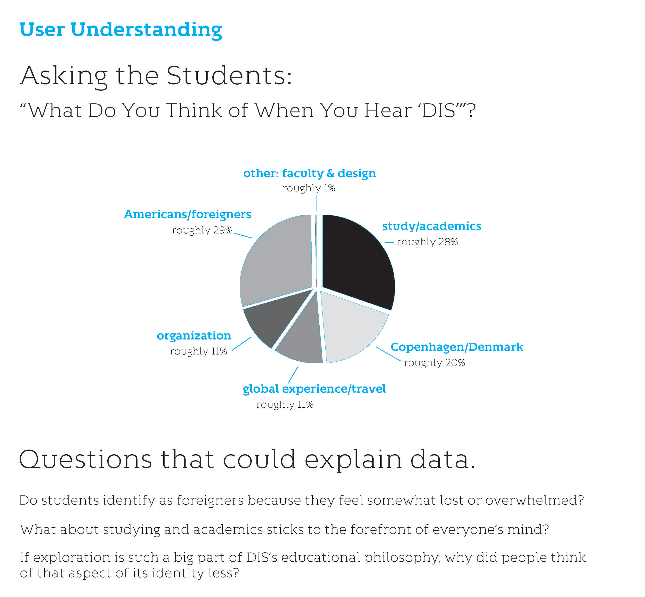
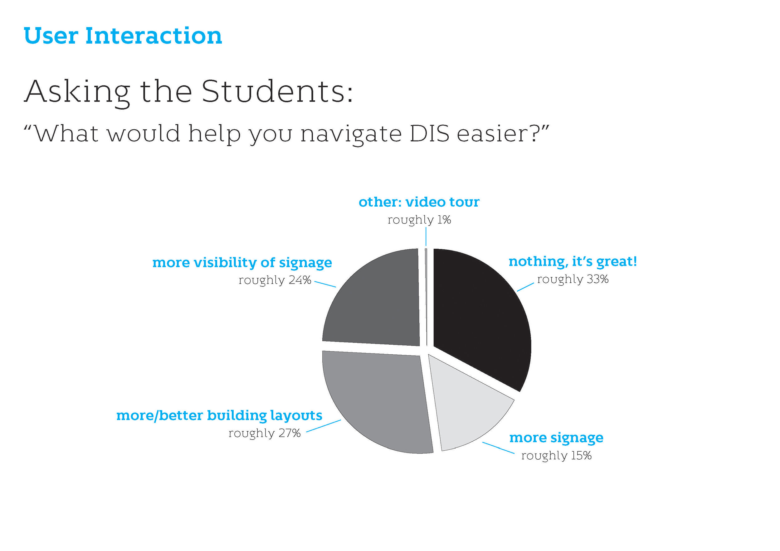
user research from students and faculty at the Danish Institute for Study Abroad in Copenhagen
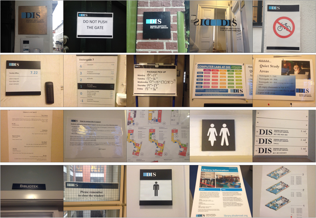

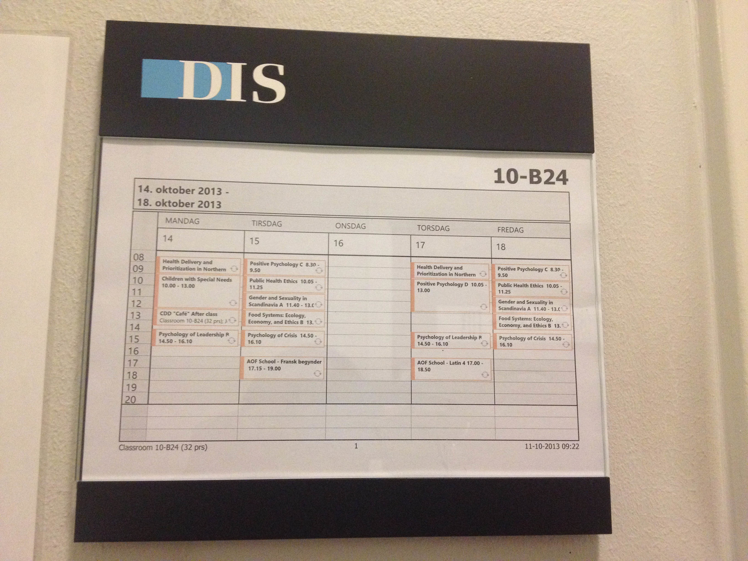
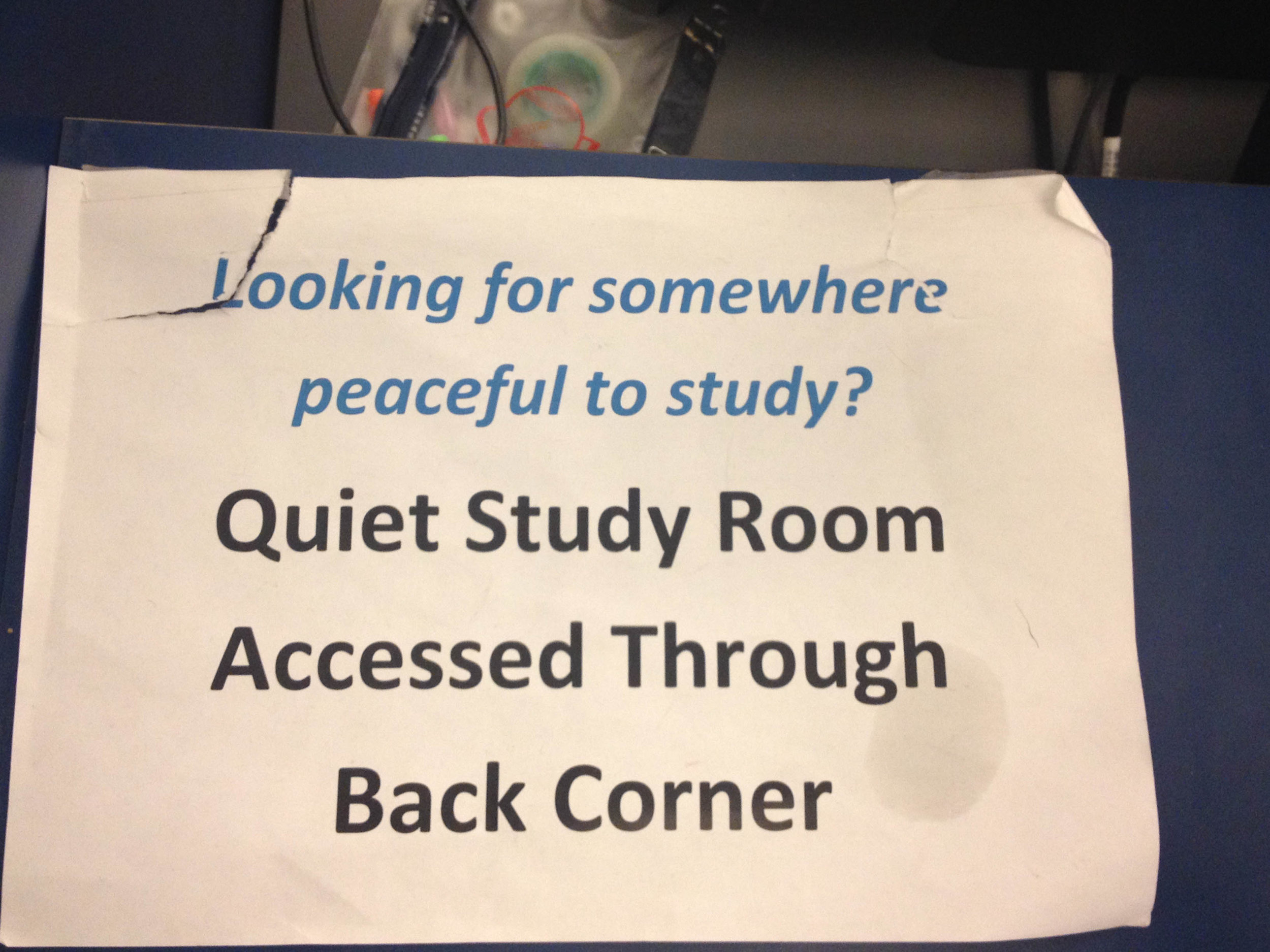
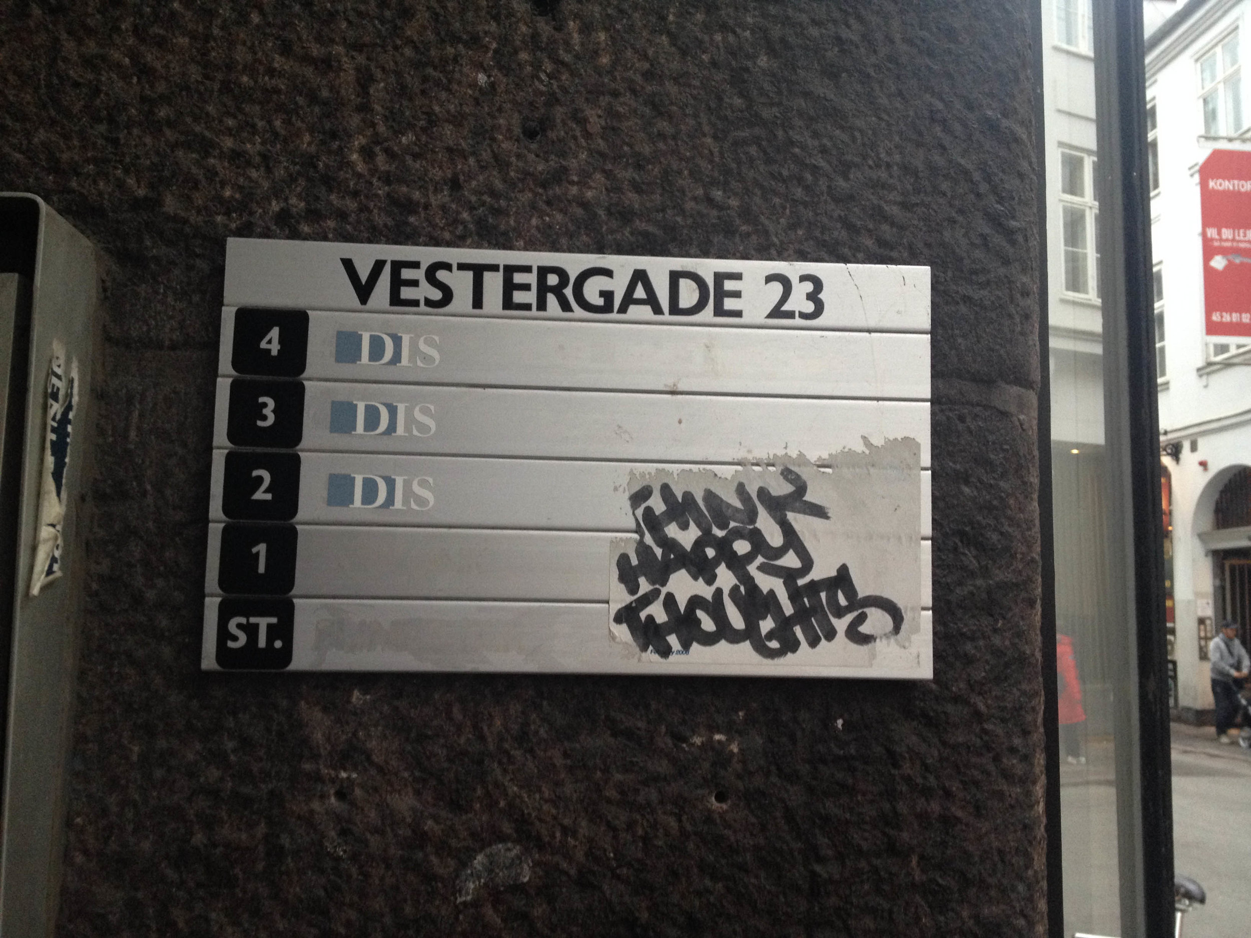
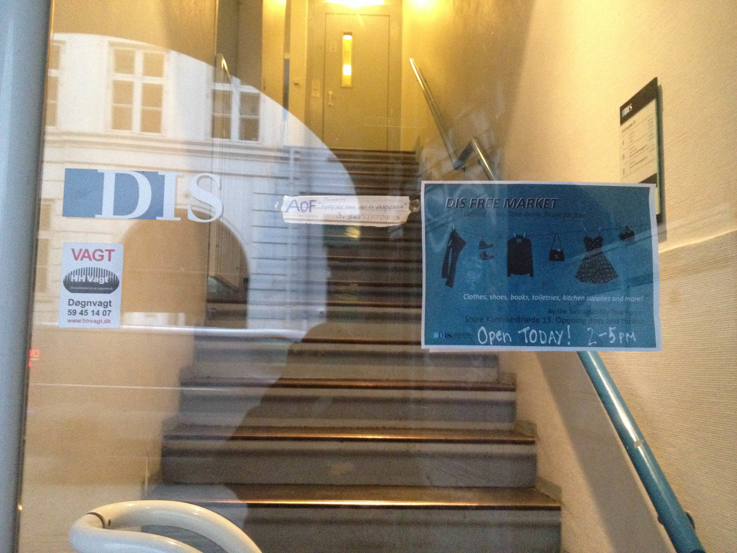
current wayfinding at DIS facilities in Copenhagen
the strategy
This program has one of the most unique learning structures I've ever experienced. Admins and faculty really do believe in the power of immersive learning and provide every opportunity for students to discover themselves and careers they love. DIS takes pride in its ability to provide a strong balance of structure and freedom. Since this was so essential to the program, I decided to focus my redesign on this function. But it needed to go a bit further. How could students also better visualize themselves within this kind of structure and navigate their environment?
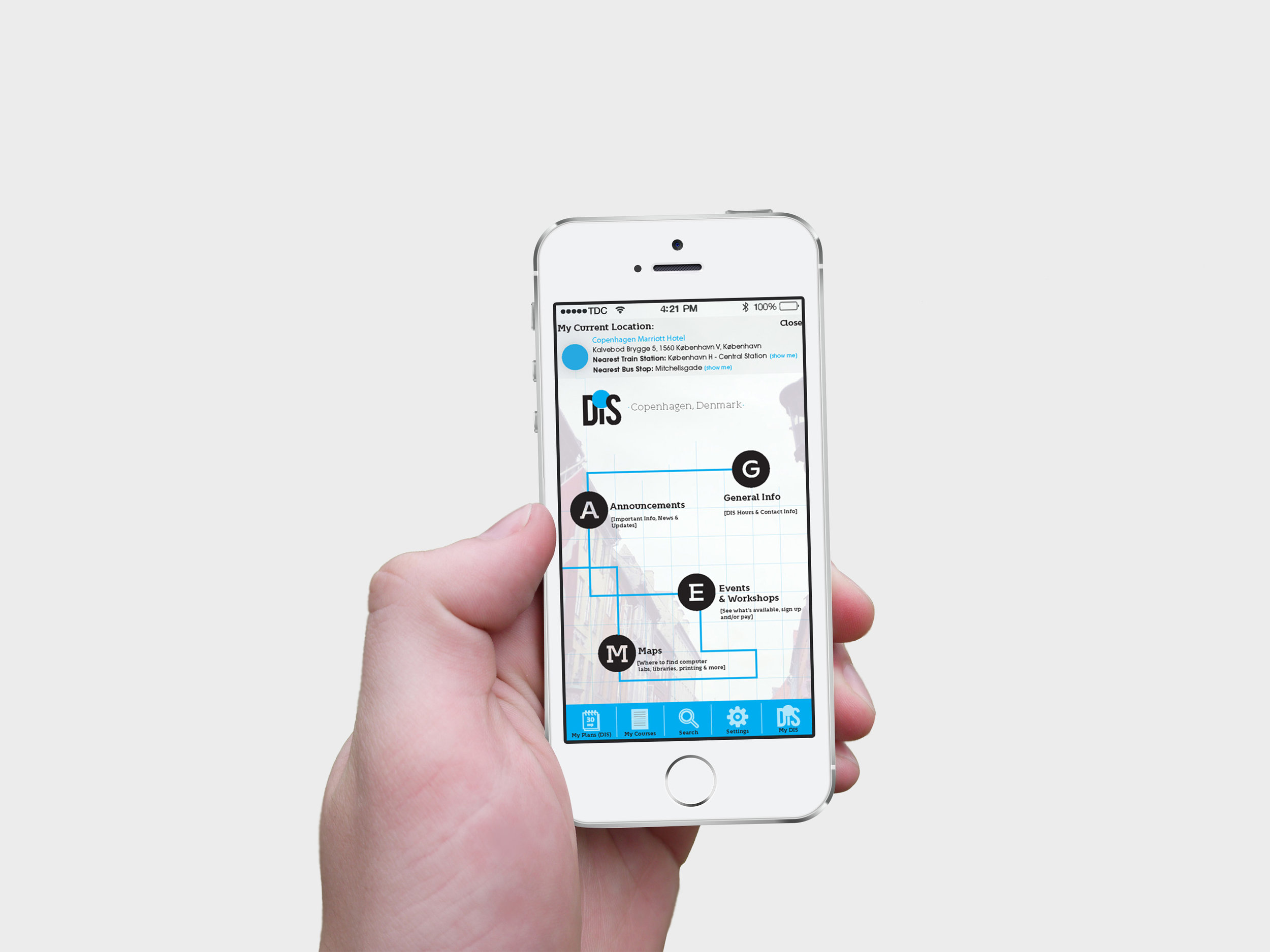
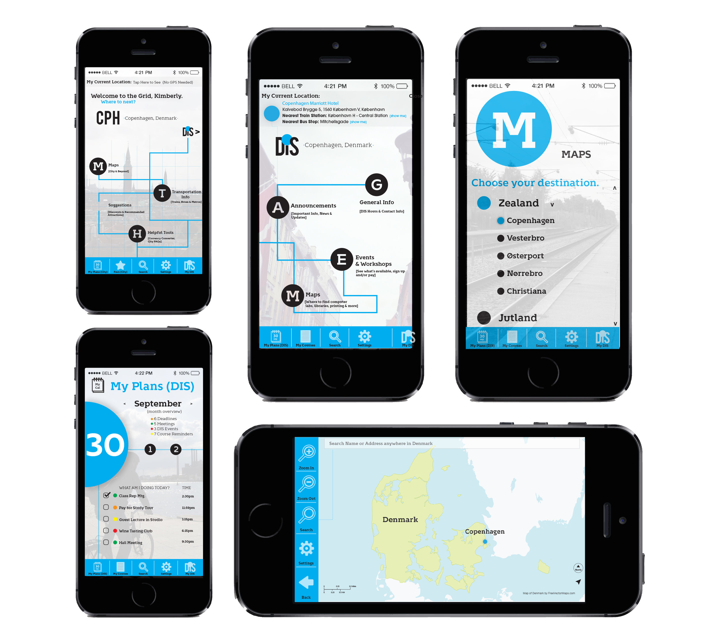
After collaborating and researching with students and the DIS marketing team, we identified a need for better wayfinding. This led to the development of the overarching concept called "Welcome to the Grid." The grid represents the structure of the program, and the dots on the grid represent students and where they choose to place themselves.
the solution
Create a brand experience that makes wayfinding natural.
1. Speak to DIS’ explorative nature
2. Consolidate resources and improve usability
3. Give current students a stronger voice
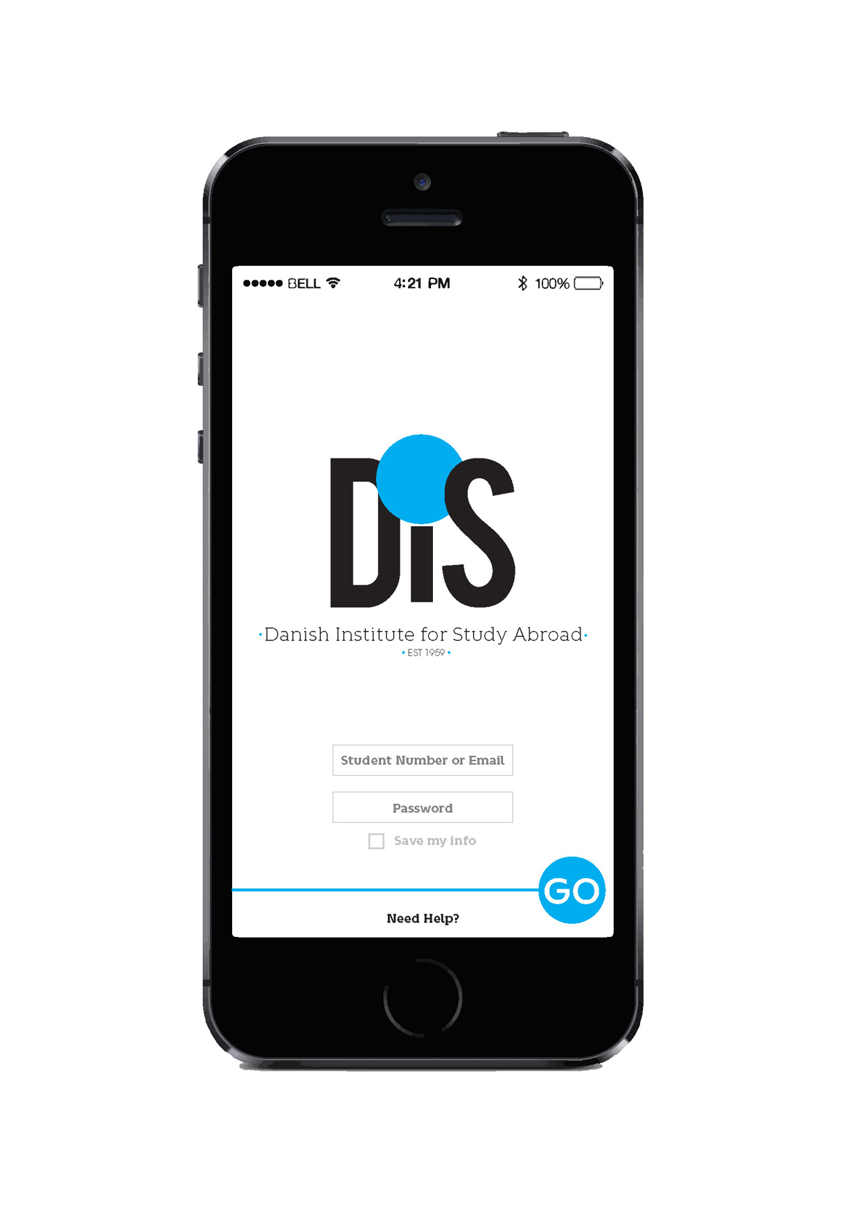
4. Design an app that could improve wayfinding
Since DIS works much like a grid system for its students, I chose to position it as such. Though the program doesn’t require students to stick to a strict, linear path or curriculum, the institute does provide abundant structure for easy, convenient orientation. At the same time, if students want to go “off the grid” and take courses unrelated to their field of study or try something new, DIS leaves plenty of room for them to do so. Students can explore academically, create an educational path of choice, and place themselves wherever they'd like to be. That placement is signified throughout the brand by a blue dot, which represents the student and where he or she is literally or figuratively in their journey at DIS. Using the blue dot inside of the grid concept along with detailed mapping, signage and a wayfinding app all worked to meet the needs of the brief.


sketches for "Welcome to the Grid" concept


wayfinding proposal for DIS

To learn more, visit www.disabroad.org.
DIS strategy development, user research, visual identity, copywriting, photography, and design work: Kimberly N. Thomas
Project produced in 2013 | All rights reserved.